New visual style guidelines
The Oslo Center
The Oslo Center is an independent non-profit organization working in democratization and democratic governance to promote democratic practices through bolstering political and governmental institutions.
We partnered here to find a new direction in what a new “greener” design, image and impact stories could do for putting a more human face to reporting and other brand assets.

A new look and feel for showing the warmer side of a scandinavian ngo
The Oslo Center had opened a new chapter in their evolution. A lot of new organizational changes eventually led to reflecting more on who the organization is, what image they project, and what face they put on the impact work they do.
Starting with the bare minimum of a new brand identity (only logo, colors + typeface), our task here was to take those elements and turn that into a new interpretation and look for how TOC’s brand + story is expressed. To put a more human face on their impact and translate how the reach of what they do in the real world can come to life in their 2d world of printed assets, communications and reports.
Services
Brand Identity/Communication
Print Design, Identity Design, Annual Report
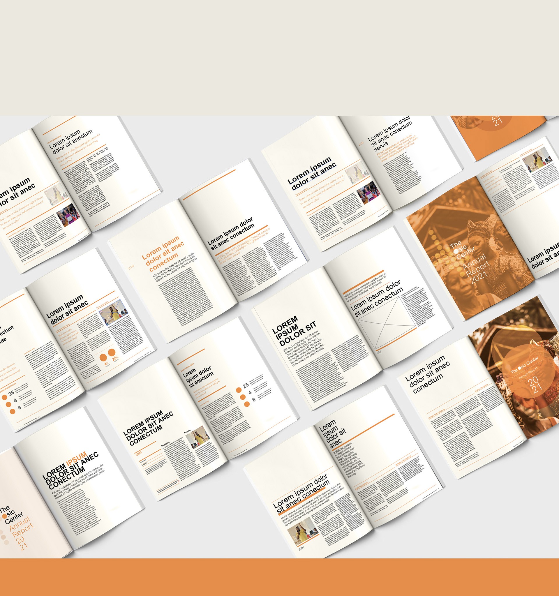
The work
Defining a visual design language to shape what kind of story a report could tell.
In addition to visual branding and defining a design language, we partnered as a consultant in helping to develop what story a report could become. The idea is really so simple. The reports that are printed, are done in a sustainable way. - uncoated, Recycled paper from sustainable managed forests - More environmentally friendly printing methods - and Print only what’s absolutely necessary when digital isn’t an option
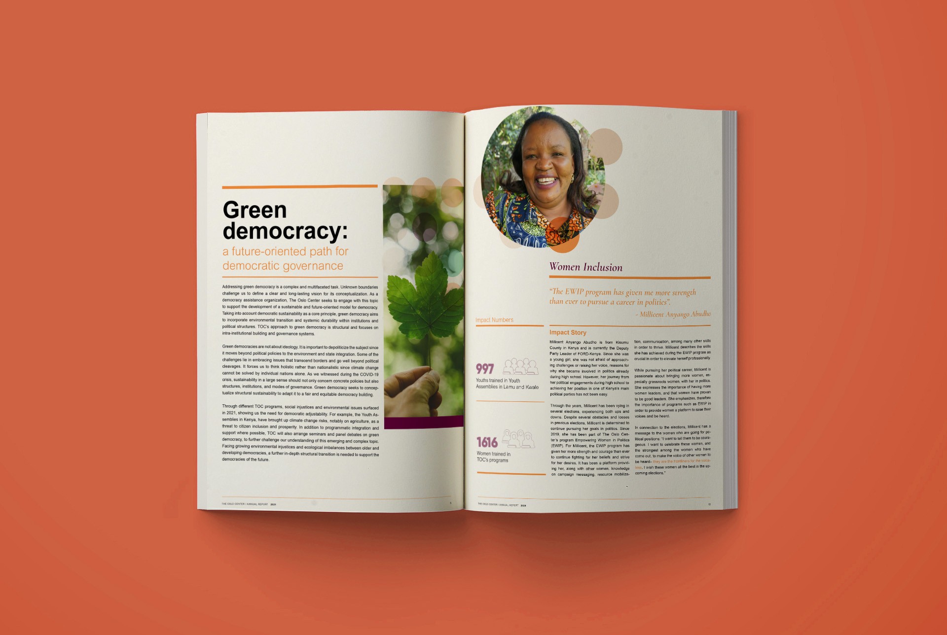
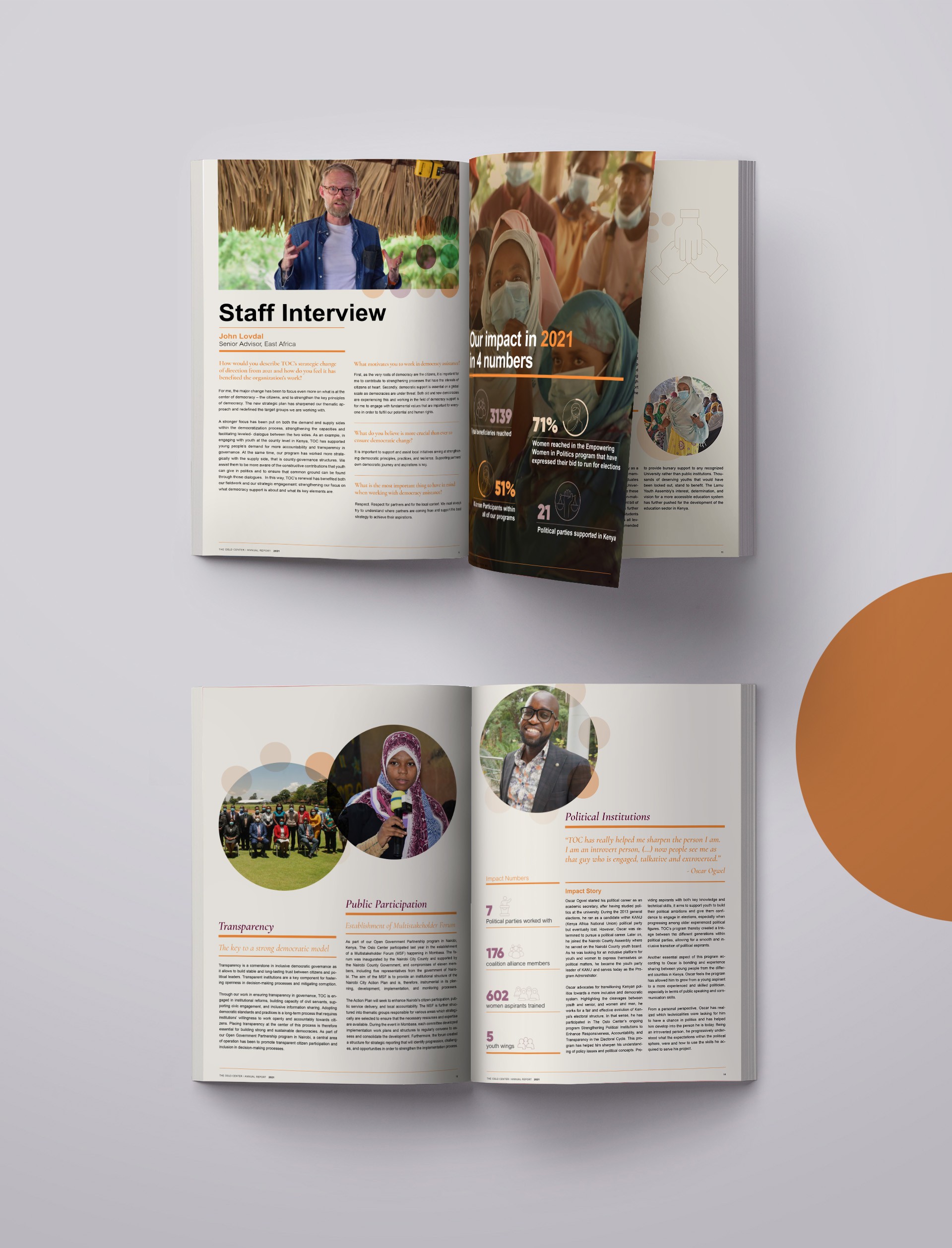
The Challenge
Aligning a human motif to the annual report, positioning around a more personal account of their impact.
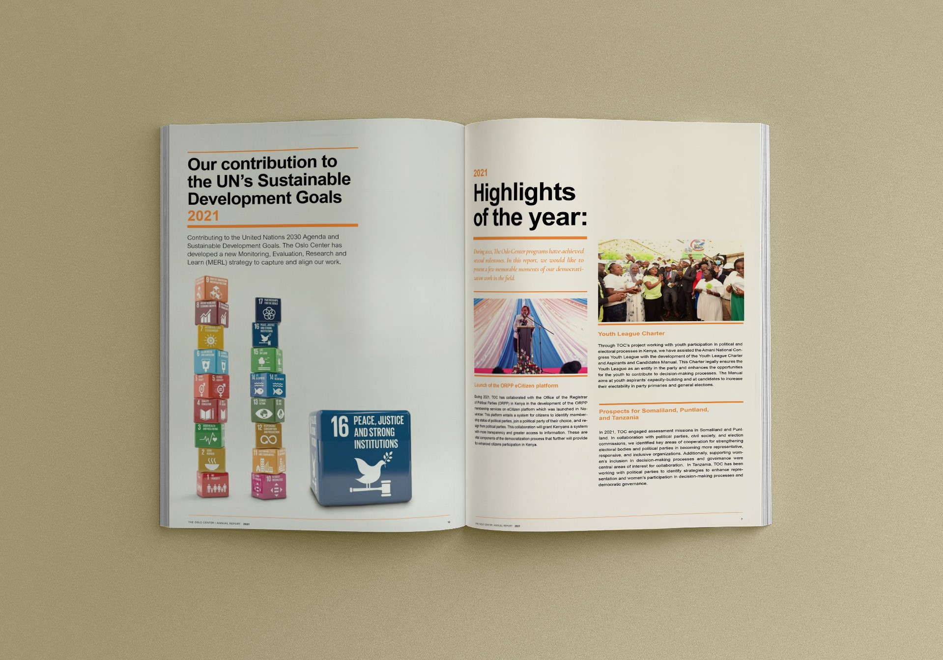
Besides promoting democratic governance, TOC works as well in promoting more “Green democracy”. so in the spirit of expressing a brand’s beliefs + values in every moment, these printed materials were a great opportunity to manifest this new brand direction and bring those beliefs to life. The opportunity here was to use these public facing materials to express the storytelling, emotion and intention of the great work they do at home and in other parts of the world. We wanted to balance the humility of Scandinavian sensibilities with a warmer and more emotional (design) face on the work they do and a new accessibility to the more personal impact stories they tell.
The Challenge
Aligning a human motif to the annual report, positioning around a more personal account of their impact.
Besides promoting democratic governance, TOC works as well in promoting more “Green democracy”. so in the spirit of expressing a brand’s beliefs + values in every moment, these printed materials were a great opportunity to manifest this new brand direction and bring those beliefs to life. The opportunity here was to use these public facing materials to express the storytelling, emotion and intention of the great work they do at home and in other parts of the world. We wanted to balance the humility of Scandinavian sensibilities with a warmer and more emotional (design) face on the work they do and a new accessibility to the more personal impact stories they tell.
Shared works in progress
Initial style explorations
Shared works in progress
Initial style explorations
Shared works in progress
Initial style explorations
"/><stop offset="0.2718446601941748" stop-color="rgb(19, 158, 171)"/><stop offset="0.5728155339805825" stop-color="rgb(67, 61, 227)"/><stop offset="1" stop-color="rgb(222, 38, 179)"/></linearGradient></defs><path d="M 31.88 0 C 32.76 0 33.2 0 33.578 0.11 C 34.276 0.312 34.866 0.781 35.221 1.415 C 35.414 1.758 35.514 2.187 35.714 3.044 C 36.539 6.589 36.952 8.362 37.515 8.923 C 38.571 9.976 40.272 10.003 41.361 8.985 C 41.942 8.443 42.411 6.684 43.351 3.167 L 43.406 2.96 C 43.636 2.098 43.752 1.667 43.962 1.324 C 44.319 0.74 44.88 0.309 45.536 0.114 C 45.922 0 46.368 0 47.261 0 L 51.091 0 C 51.902 0 52.308 0 52.659 0.094 C 53.402 0.292 54.029 0.789 54.39 1.467 C 54.561 1.788 54.653 2.184 54.837 2.974 C 55.617 6.325 56.008 8.001 56.506 8.54 C 57.588 9.709 59.431 9.727 60.536 8.579 C 60.981 8.116 61.367 6.755 62.034 4.142 L 62.338 2.944 C 62.543 2.137 62.645 1.733 62.826 1.412 C 63.19 0.764 63.799 0.29 64.517 0.096 C 64.872 0 65.282 0 66.102 0 L 89.149 0 C 93.556 0 101.934 1.133 101.934 8.436 C 102.048 11.292 101.302 13.283 100.106 14.68 C 98.958 16.021 98.384 16.691 98.233 17.36 C 98.027 18.266 98.027 18.264 98.409 19.111 C 98.691 19.736 99.299 20.21 100.515 21.157 C 101.999 22.314 103 24.022 103 26.568 C 103 33.871 96.578 36.768 91.038 36.768 L 75.771 36.768 C 75.214 36.768 74.936 36.768 74.703 36.728 C 73.547 36.529 72.641 35.623 72.442 34.467 C 72.402 34.234 72.402 34.058 72.402 33.5 C 72.402 30.275 72.5 30.031 72.5 27 C 72.5 24.891 70.64 23.11 68.773 26.873 C 66.905 30.635 65.03 34.939 65 35 C 64.616 35.763 63.866 36.549 63.028 36.715 C 62.762 36.768 62.46 36.768 61.858 36.768 L 57.27 36.768 C 56.207 36.768 55.675 36.768 55.219 36.603 C 54.725 36.425 54.292 36.109 53.97 35.694 C 53.673 35.311 53.51 34.805 53.183 33.793 L 53.079 33.473 C 51.899 29.823 51.309 27.998 50.525 27.464 C 49.543 26.796 48.245 26.827 47.297 27.542 C 46.539 28.114 46.038 29.965 45.036 33.668 C 44.764 34.673 44.628 35.175 44.362 35.563 C 44.029 36.05 43.548 36.418 42.991 36.613 C 42.547 36.768 42.027 36.768 40.985 36.768 L 36.269 36.768 C 35.05 36.768 34.441 36.768 33.932 36.556 C 33.482 36.37 33.089 36.069 32.794 35.682 C 32.458 35.244 32.301 34.655 31.987 33.478 L 26.69 13.615 C 26.376 12.438 26.219 11.849 25.884 11.411 C 25.588 11.025 25.195 10.723 24.746 10.536 C 24.236 10.325 23.627 10.325 22.408 10.325 L 13.473 10.325 C 12.221 10.325 11.207 11.34 11.207 12.592 C 11.207 13.843 12.221 14.858 13.473 14.858 L 19.011 14.858 C 20.187 14.858 20.775 14.858 21.272 15.058 C 21.711 15.234 22.097 15.52 22.394 15.888 C 22.731 16.304 22.903 16.867 23.248 17.991 L 23.426 18.57 C 24.021 20.511 24.319 21.482 24.111 22.252 C 23.93 22.926 23.5 23.507 22.909 23.878 C 22.234 24.302 21.218 24.302 19.188 24.302 L 15.639 24.302 C 14.087 24.302 13.312 24.302 12.719 24.604 C 12.198 24.87 11.774 25.293 11.509 25.814 C 11.207 26.407 11.207 27.183 11.207 28.734 L 11.207 32.335 C 11.207 33.887 11.207 34.663 10.905 35.255 C 10.639 35.777 10.215 36.2 9.694 36.466 C 9.102 36.768 8.326 36.768 6.774 36.768 L 4.432 36.768 C 2.881 36.768 2.105 36.768 1.512 36.466 C 0.991 36.2 0.568 35.777 0.302 35.255 C 0 34.663 0 33.887 0 32.335 L 0 4.432 C 0 2.881 0 2.105 0.302 1.512 C 0.568 0.991 0.991 0.568 1.512 0.302 C 2.105 0 2.881 0 4.432 0 Z M 84.427 22.035 C 84.369 22.035 84.34 22.035 84.315 22.036 C 82.824 22.062 81.621 23.265 81.595 24.756 C 81.594 24.781 81.594 24.81 81.594 24.868 C 81.594 24.927 81.594 24.956 81.595 24.981 C 81.621 26.472 82.824 27.674 84.315 27.701 C 84.34 27.701 84.369 27.701 84.427 27.701 L 86.253 27.701 C 87.638 27.701 89.779 27.047 89.779 24.679 C 89.779 22.564 87.638 22.035 86.253 22.035 Z M 84.301 8.94 C 82.806 8.94 81.594 10.152 81.594 11.647 C 81.594 13.142 82.806 14.354 84.301 14.354 L 86.253 14.354 C 87.218 14.312 89.149 13.7 89.149 11.584 C 89.149 9.469 87.218 8.94 86.253 8.94 Z" fill="url(%23he5NoDYNN-2696810313-linear-gradient)" height="36.767726161409556px" id="he5NoDYNN" transform="translate(7 8)" width="103px"/></svg>)
Get in touch!
We’d love to hear from you.
hello@fwbcause.com
© FWB Cause. All rights reserved.
Get in touch!
We’d love to hear from you.
hello@fwbcause.com
© FWB Cause. All rights reserved.
Get in touch!
We’d love to hear from you.
hello@fwbcause.com
© FWB Cause. All rights reserved.